Sunday 15 May 2011

Anti fur posters


         The project was to create a poster that will show the dark side of fur trade and to prevent potential buyers from buying fur. My concept focus on the target audience, which reads glossy magazines have a large income , expensive taste and always try to keep up with the latest fashion trends. In my posters i wanted to show them what their fur really looks like and twist the beauty/class and elegance that advertising and models are trying to put out to women.

Friday 13 May 2011

Our legacy is green


     A double page illustration for Eggmag illustration Competition.The theme was to show in our own style why it is important  to grow greenery and flowers in the cities and towns.If we take care and protect nature just like a child then we will have a greener planet which will be  the legacy for the next generations.
 So in a metaphorical sense the role has change from mother nature to a child and the mother is the city/towns.
Daily we read the newspaper headlines, but nature should be top news if we really want to change the way we live and think.

Tuesday 3 May 2011


 Final illustrations.
References from propaganda posters in color and composition/scale .


Second stage is the selection of 5 ideas and the final illustration. 
Illustrations drawn by hand and finished  on the computer.

 Starting with brainstorming and first initial ideas for the project.  Terroriam has become an international problem so my concept  was based on the  common perception of peace symbols. Dove /victory sign / peace symbol etc.

Anti-terrorism illustration posters

The theme was the evil face of terrorism in killing innocent people. these were the illustration produce for the international contest and then extended as a series of poster as a self promotional project.  

Tuesday 22 March 2011

Editorial Illustration Project

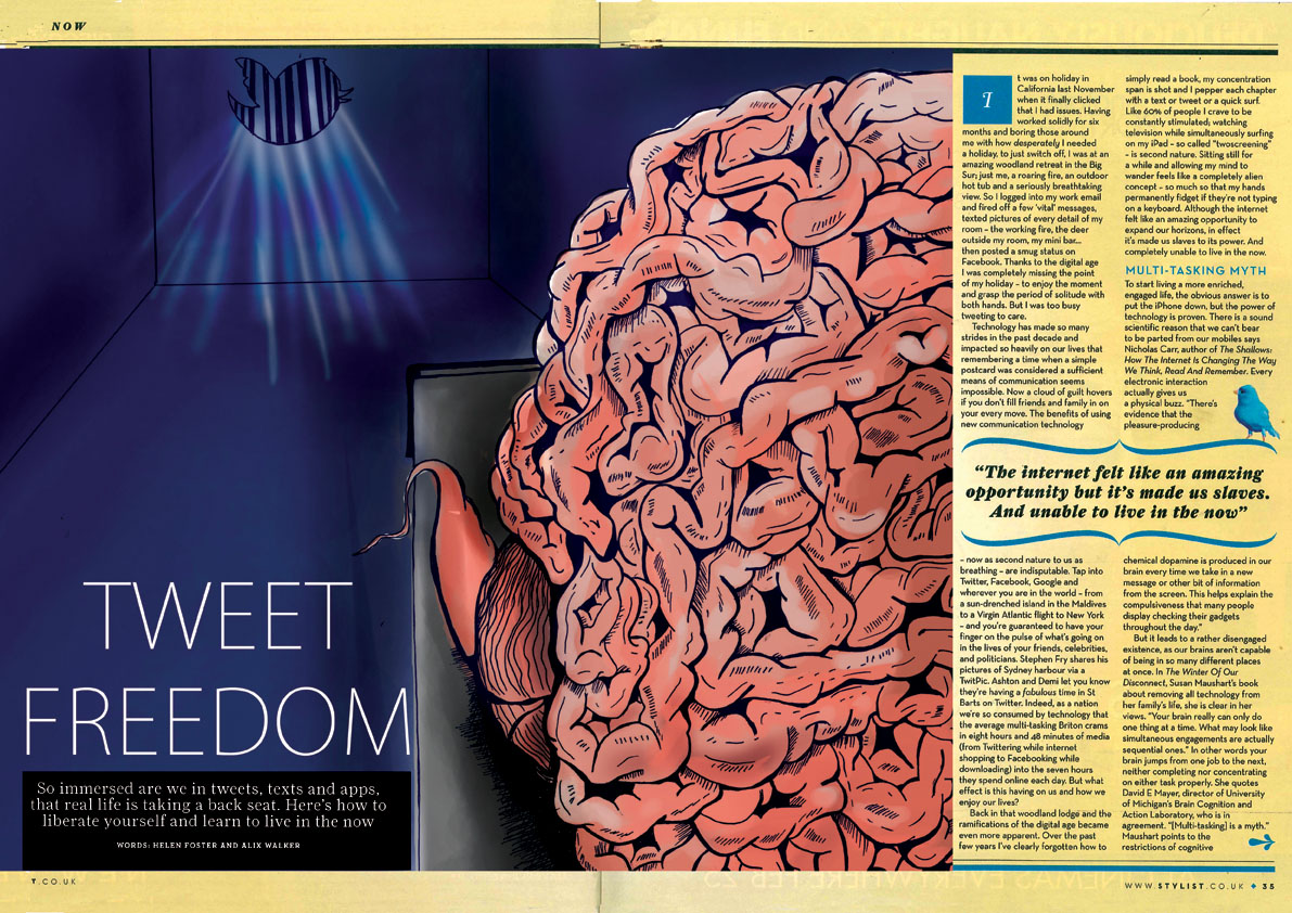
  I recently read an article about the impact of technology in our life's. It was emphasized that due to technology, people that go to work , or even  go on vacations have developed a depended  relationship with them. I found it to be a very interesting article so i decided to illustrate to make it more attractive to readers. Having ready made pictures for an article can be easy but to produce an illustration just for the specific article is  challenging.

So this is the process that I created the Illustration.
This was the original ready made photo.


The article was on Stylist magazine so the target audience was important as well to convey the right message. London based magazine, with themes on lifestyle/travel/fashion etc.    


The process

    The starting point was to brainstorm key words and ideas ant then visualize them in small thumbnails.It helpful not to add to much detail and focus on the idea. In editorial Illustration making links and combine elements and different ideas together, makes the message and the visual more creative.
 I highlighted lines from the article that created visuals.


The fist is focused on how over connected are people online,
 and the second on the constant posting.


The myth that the brain can do multiple things at the same time is wrong, and we feel depressed and unfulfilled. The second was that even when people go on vacation they post what they do or all their personal  on twitter /face book/ or any kind of social network.     


This is the final illustration.